SRS - SuccessWare Remote Site
Bulding modern integrations for legacy software
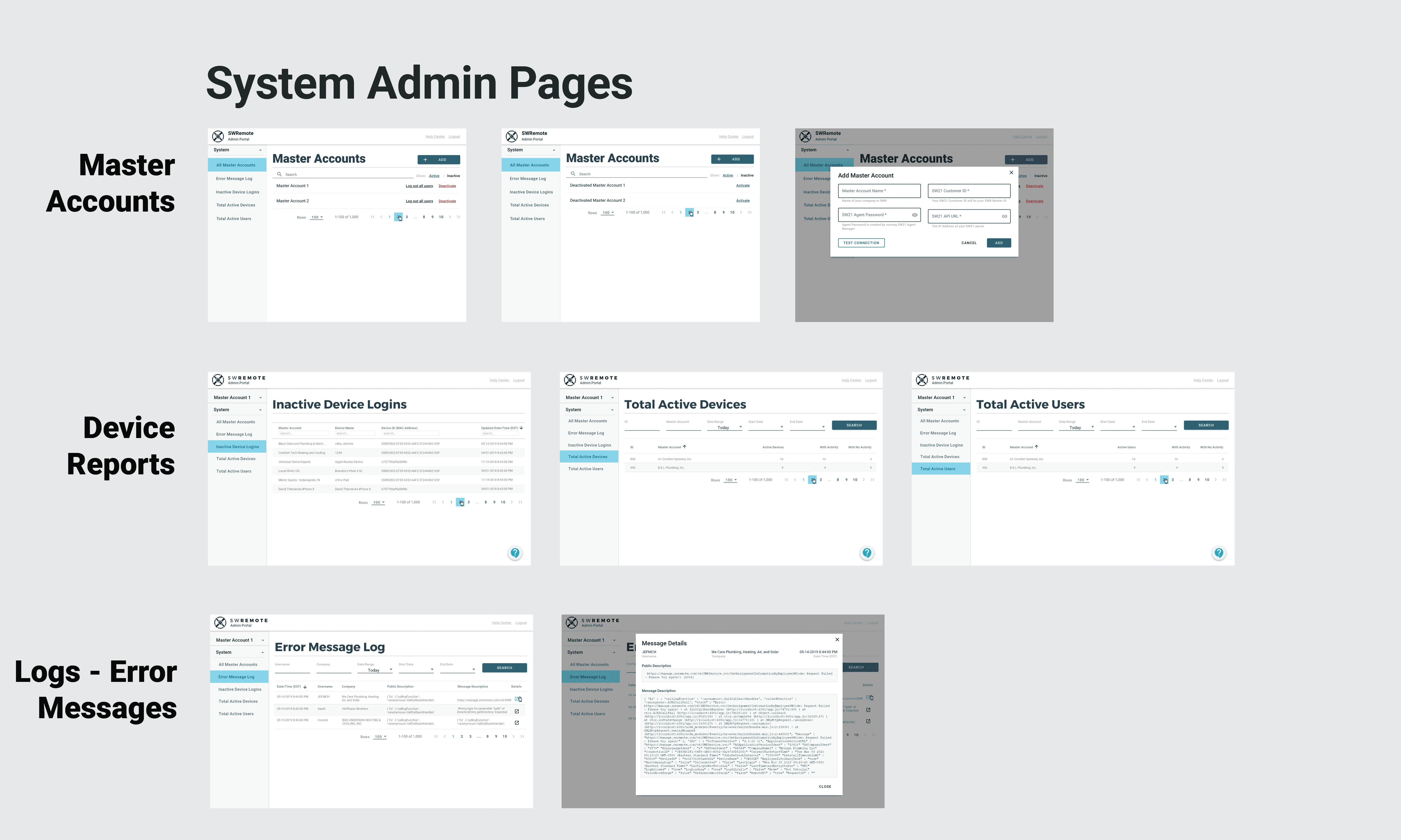
Redesign of a system administration site for SuccessWare Remote, a mobile app for the HVAC technicians in the field. This site was primarily used by the Pointman support team and account administrators for SWR customers.
- Role
- UX Design
- Timeline:
- ◊ Feb - March 2020
- Team ◊ Pointman
- David Thiemecke, Denise Nadal, Will Kerber, Krishna Gopinath
Background
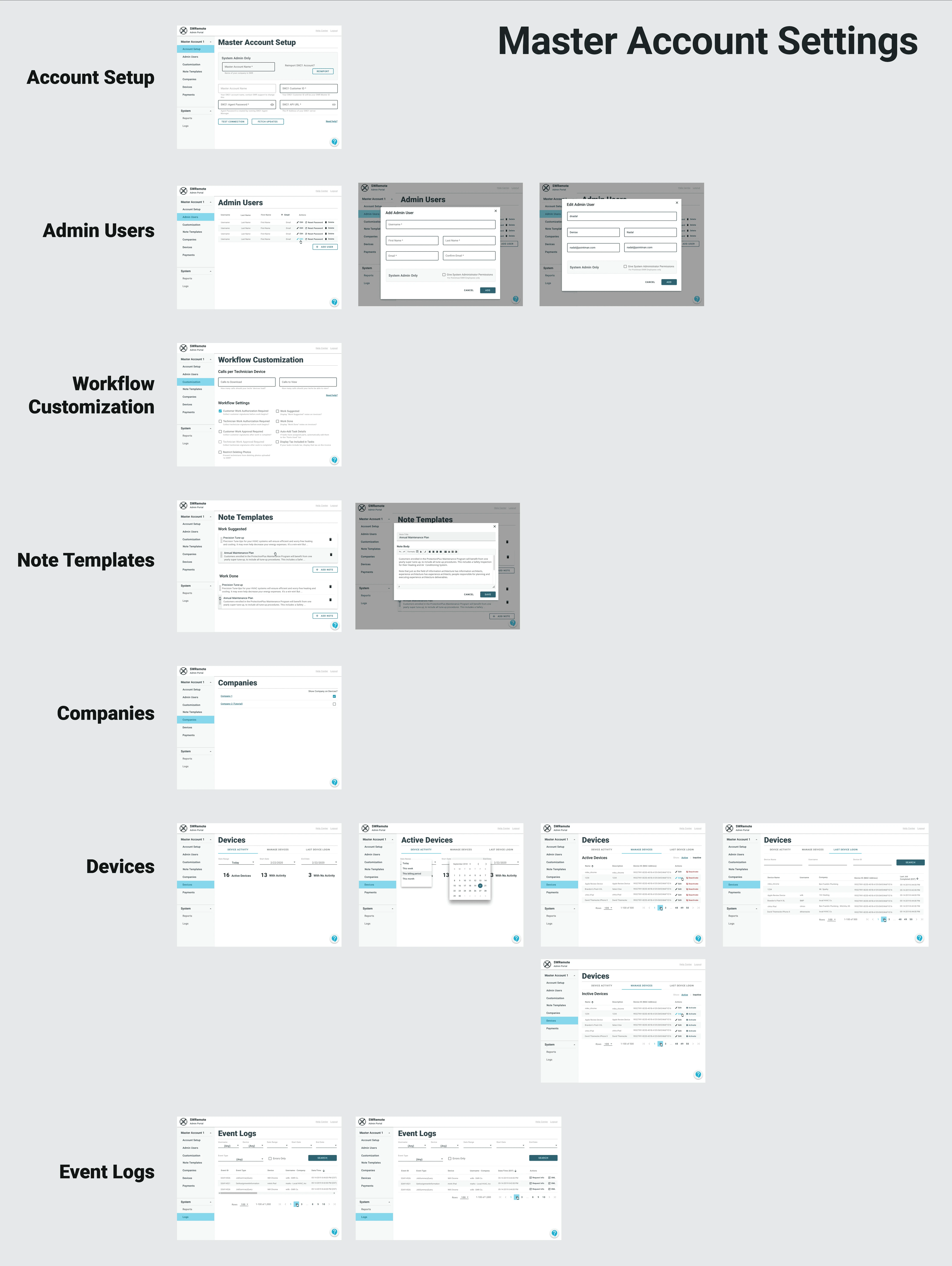
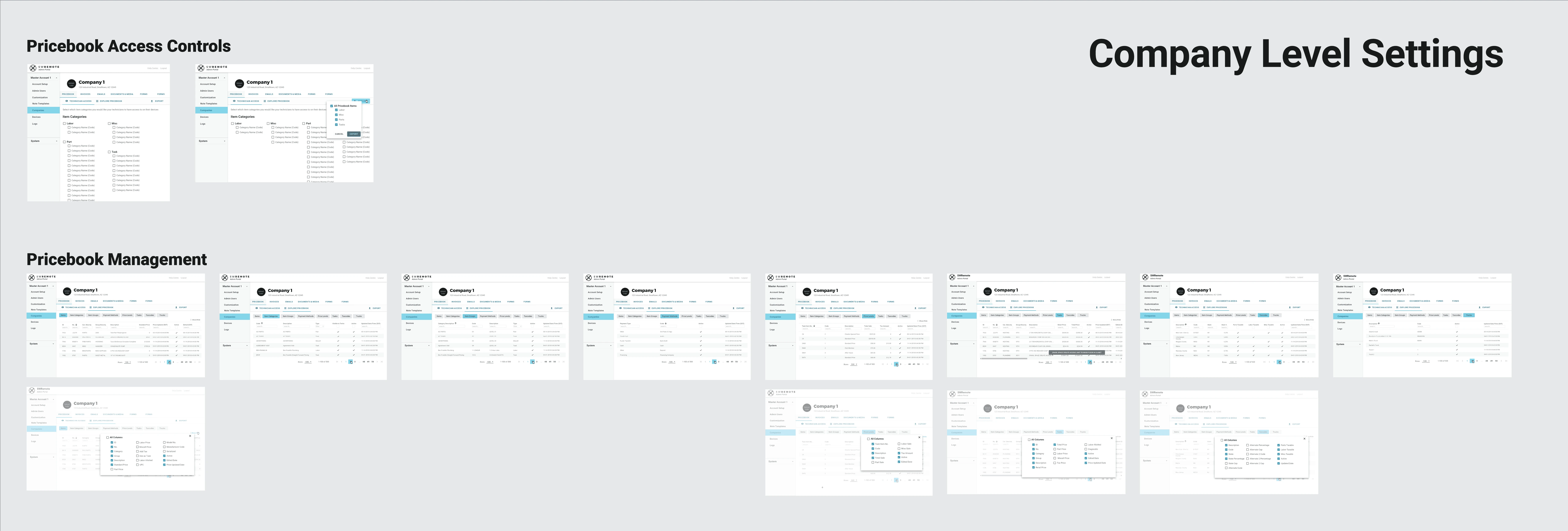
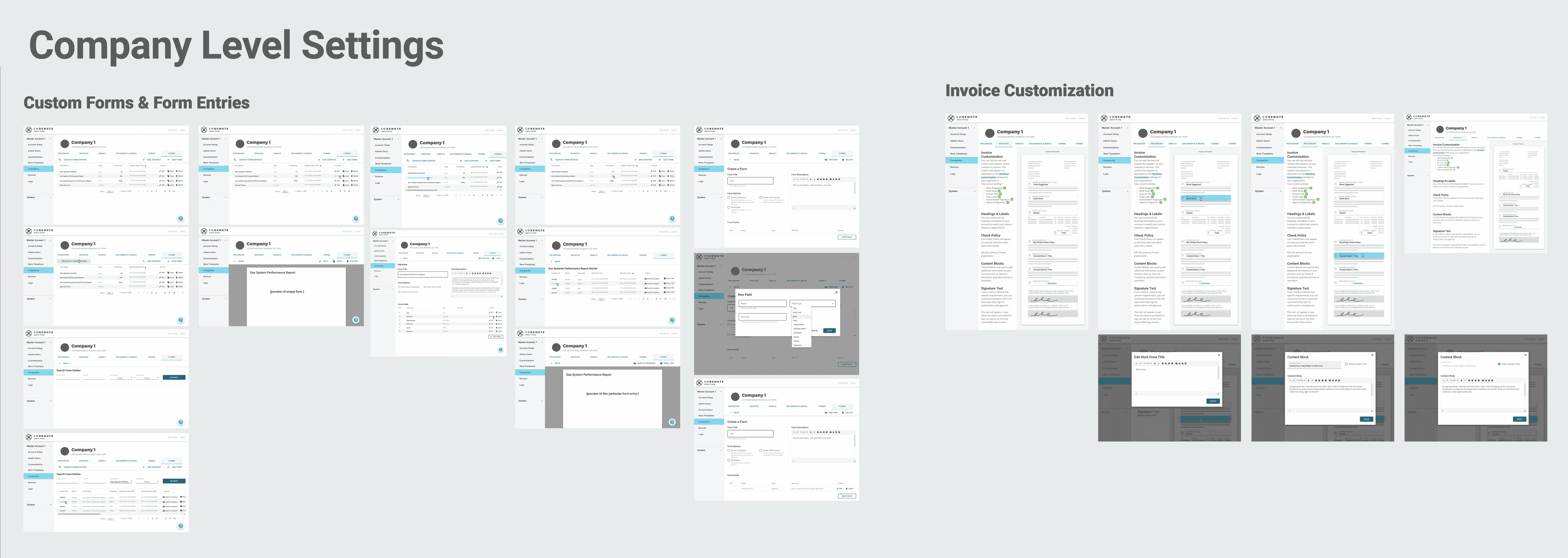
Pointman's SuccessWare Remote is an app that integrates with SucessWare21, allowing technicians in the field to access data from their office's scheduling software. We have an administration site, called SRS, which is used by the Pointman support team and the owners/administrators of companies using SWR. The site allows users to access account and workflow settings, which changes the kinds of tasks and the level of information seen by technicians who use the software on their mobile devices.
For instance, Brad owns an HVAC company, and Ted is one of his technicians. Ted is new, so Brad doesn't want him to sell quotes to customers. Brad can log into SRS and disable the quoting system for Ted, so he doesn't try to do anything he's not supposed to. Meanwhile, Ivan is an installer, and he always forgets to get customers to sign off on his work. Brad can log into SRS and turn on a feature that will prompt Ivan to get a signature every time he completes a job.
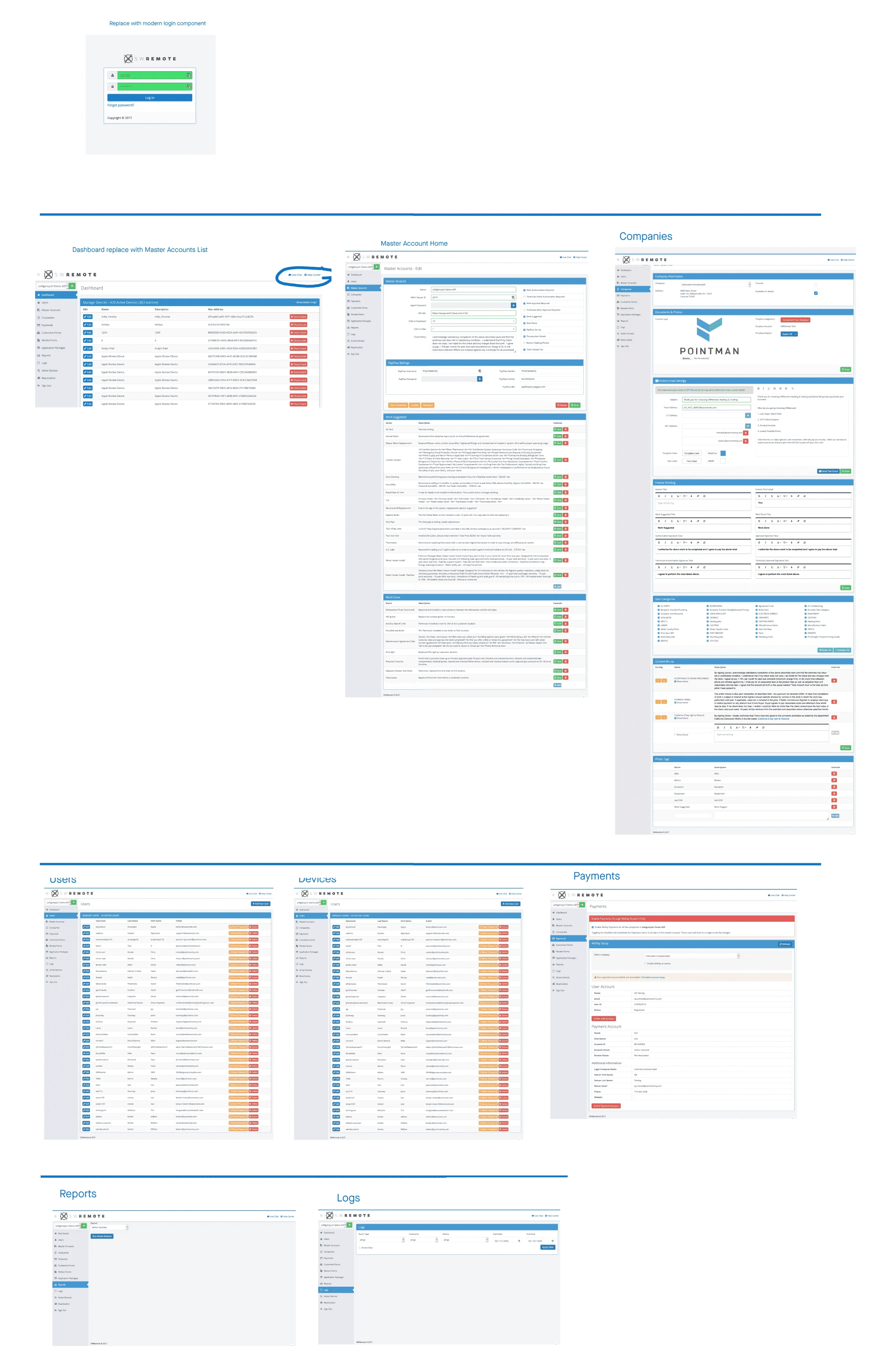
While there's a large amount of helpful features in the SRS admin site, its hard to navigate and users often have trouble using it without assistance. In order to improve user satisfaction and engagement while also decreasing the costs of support, we launched an initiative to redesign the whole admin site from the ground up.
Process
I followed a modified version of the Design Thinking process. I started with trying to find out as much as I could about the site, who used it and for what reasons, as well as what they did and didn't like about the system. Next I sketched out the logical content structure and information architecture with our support team. Then I created wireframes which I tested with users, and revised several times before working up some high-res mockups. These mockups where turned into prototypes and also went through several round of testing. From there I developed detailed screens to use as product specs to hand off to the engineers.
Research
Research for this project consisted of interviewing internal and external users. Because this administration site was used primarily by our support team assisting users, they were my primary source of information. I interviewed the support team on what features they used, what tasks they completed on behalf of users, and which tasks users frequently completed themselves. I also discovered which features went unused and areas of the site that no one seemed to know exactly how it was supposed to function.
I also interviewed members of the engineering team, who understood the data structures and the limitations of the system. Some of the most interesting insights from these interviews were
Key Findings:
- some features were built so long ago and so underused that no one knew what they did
- users rarely used the system themselves because it was too confusing
- we had dozens of reports with similar information, but none really showed the right information
- unclear why some settings/form fields were considered "account level" vs "company level"
Information Architecture
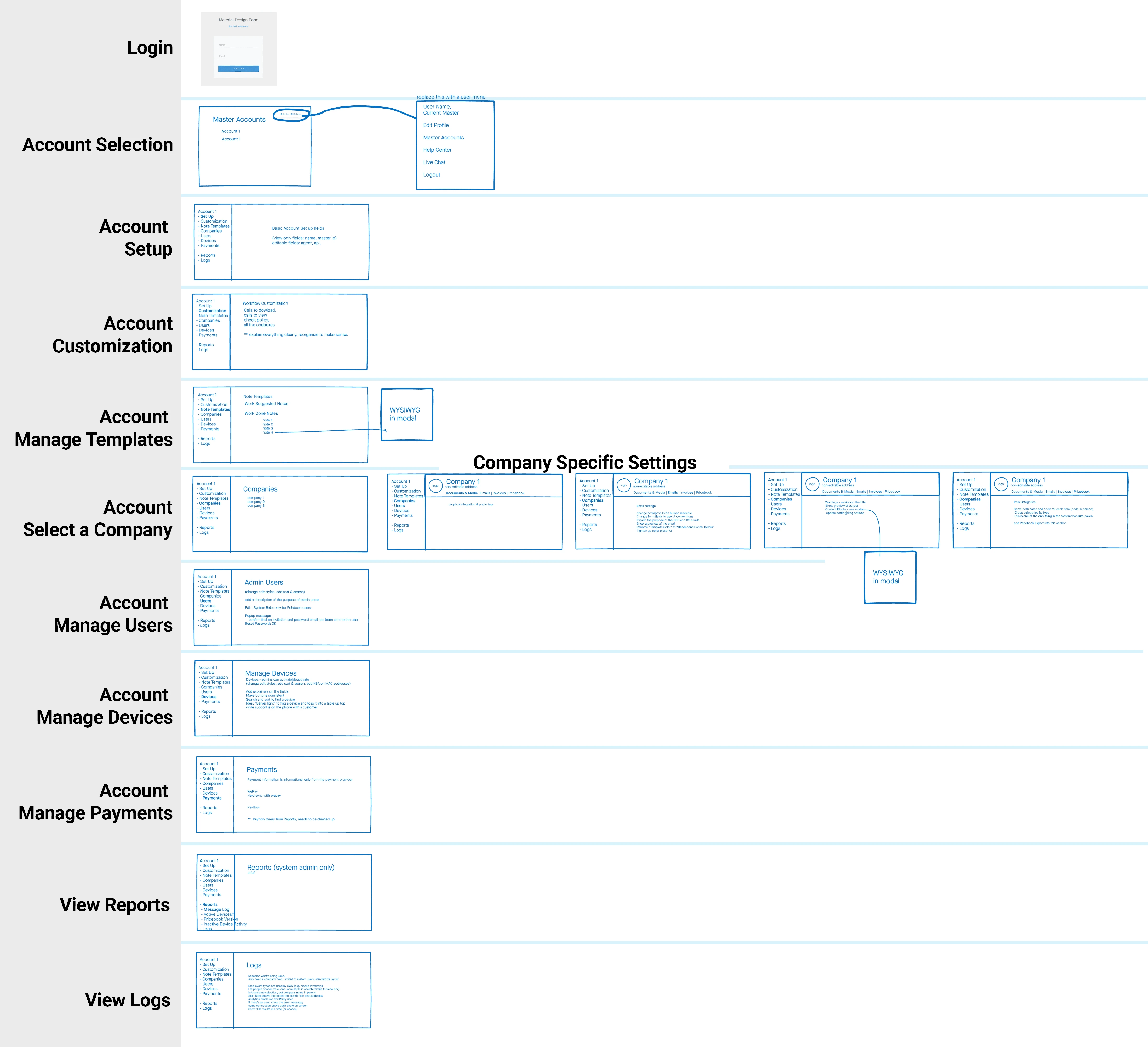
The existing screens were long and confusing- the result of almost ten years worth of adding new features where ever there happened to be room. I began my design process by analyzing the content on the pages and restructuring it logically and hierarchically.
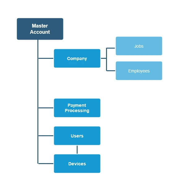
This was somewhat challenging as the data structure was as shown, right:
Wireframes
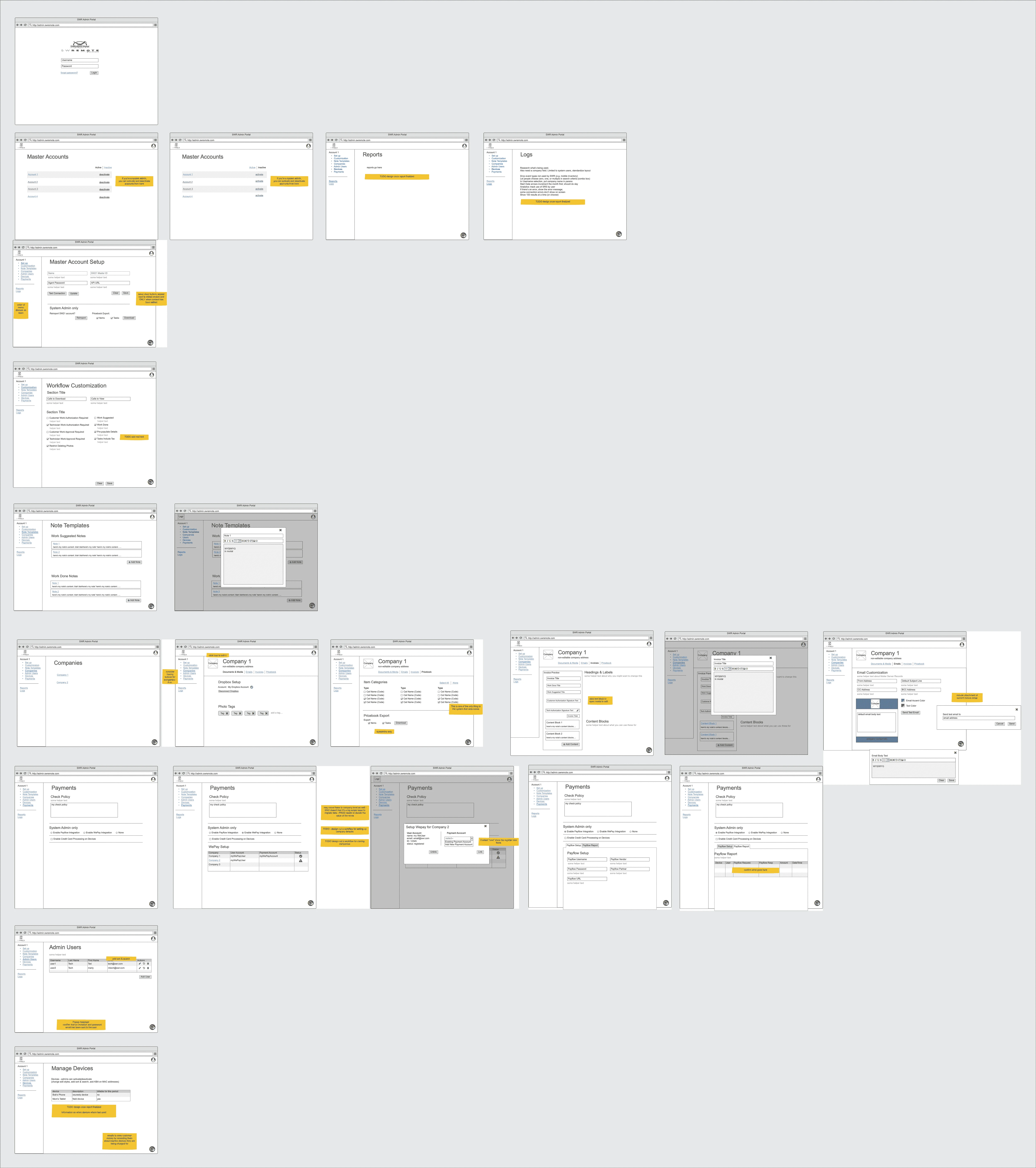
After the Information Architecture was confirmed, I started designing out the content and layout of the pages through wireframes.I then took these designs to our team and tested them with users to make sure we were on track.
Highlighted on the images are discussion points:
- Questions I uncovered during the design process
- Points of confusion in the desired workflow
- Concerns about technical implementation
- Areas that are still under exploration
Visual Design
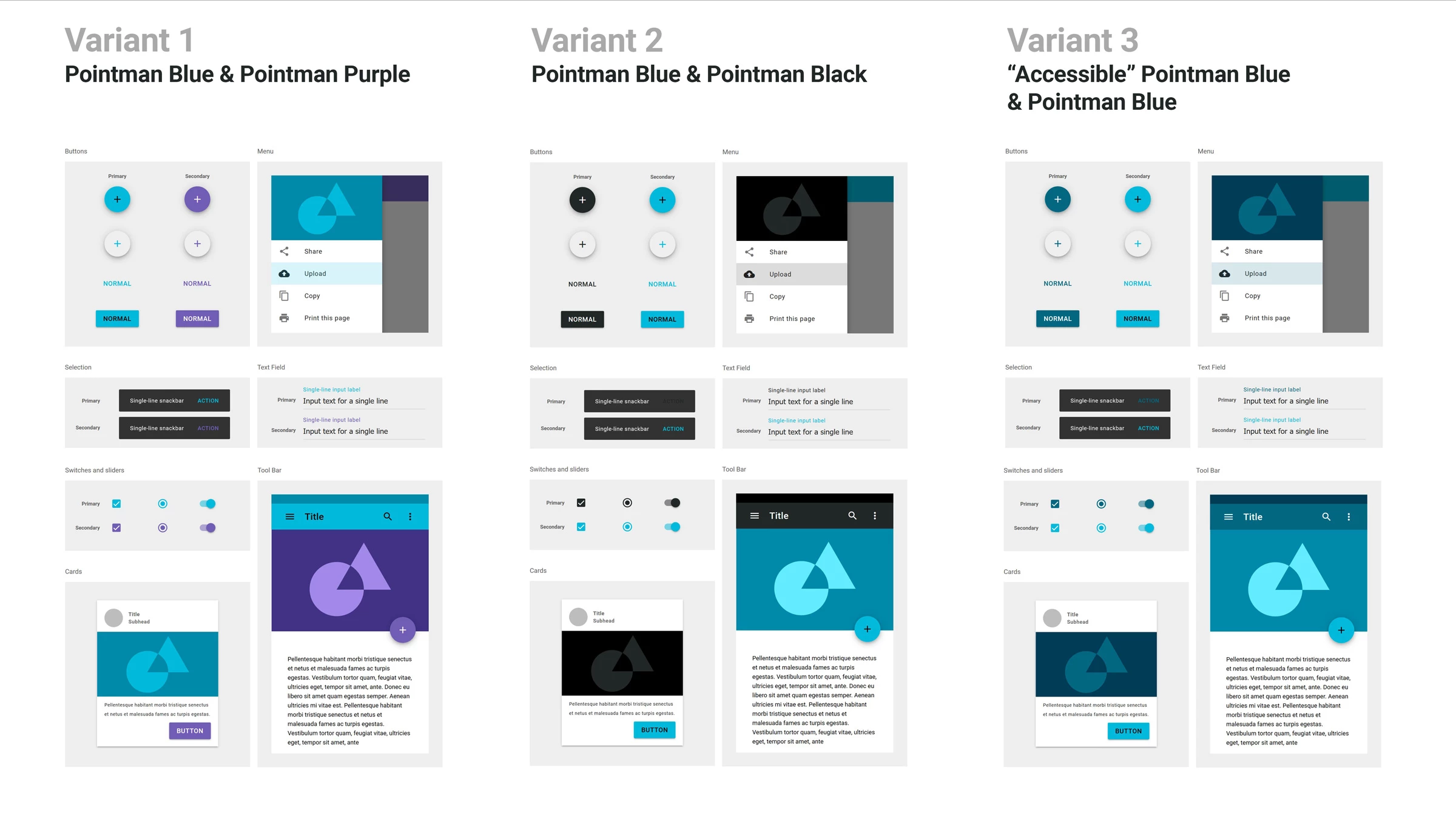
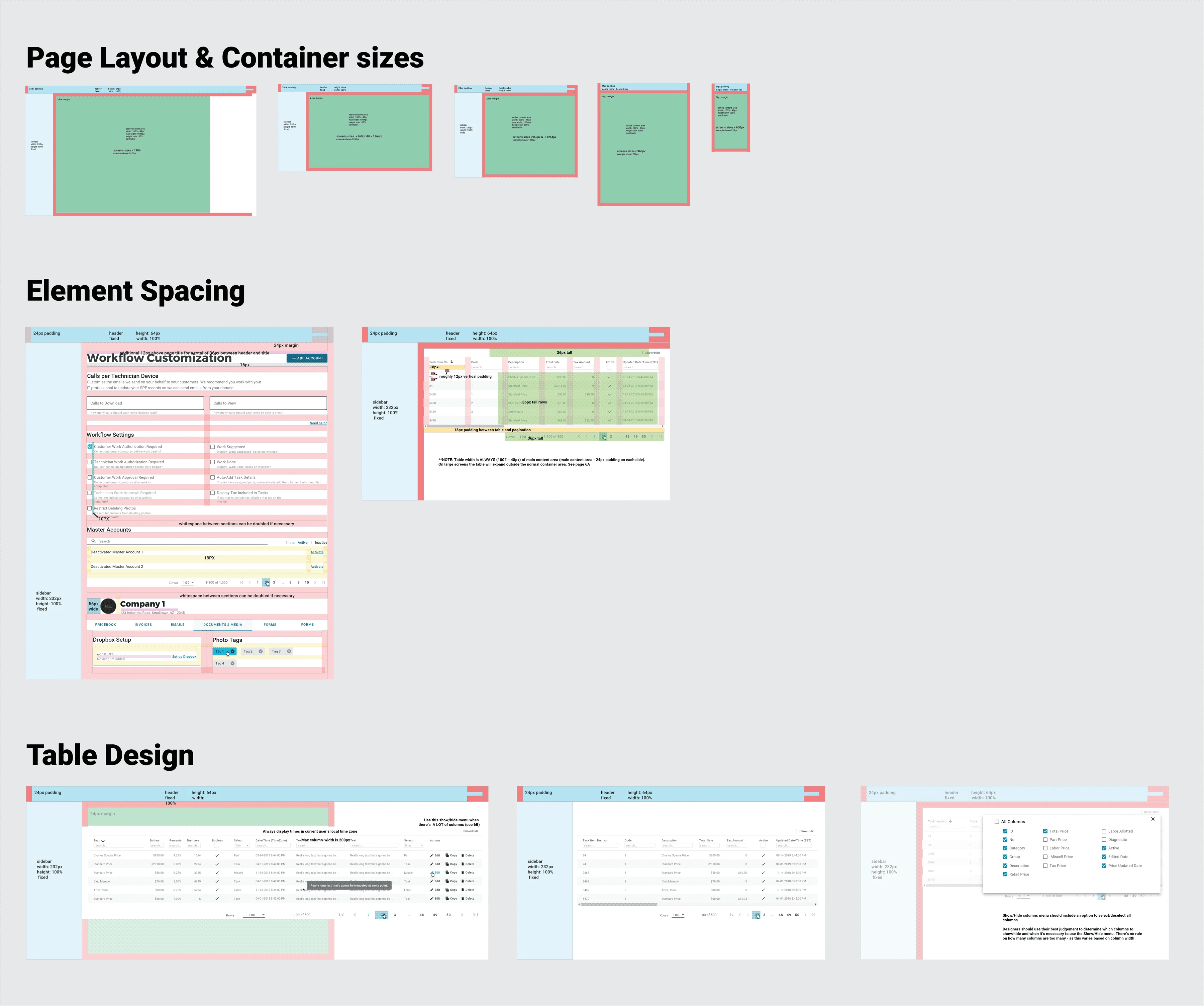
To improve the speed of development and lighten the lift on our engineering team, we've been using Google's Material Design theming for all of our apps. For building out the theme for our site, I used the Pointman brand colors as a starting point, and them mixed them up to be more suitable to accessible web design standards. Because consistent spacing is important to visual design and readability, I created some layout guides for the engineers to understand how to space elements and arrange content on different sized devices.
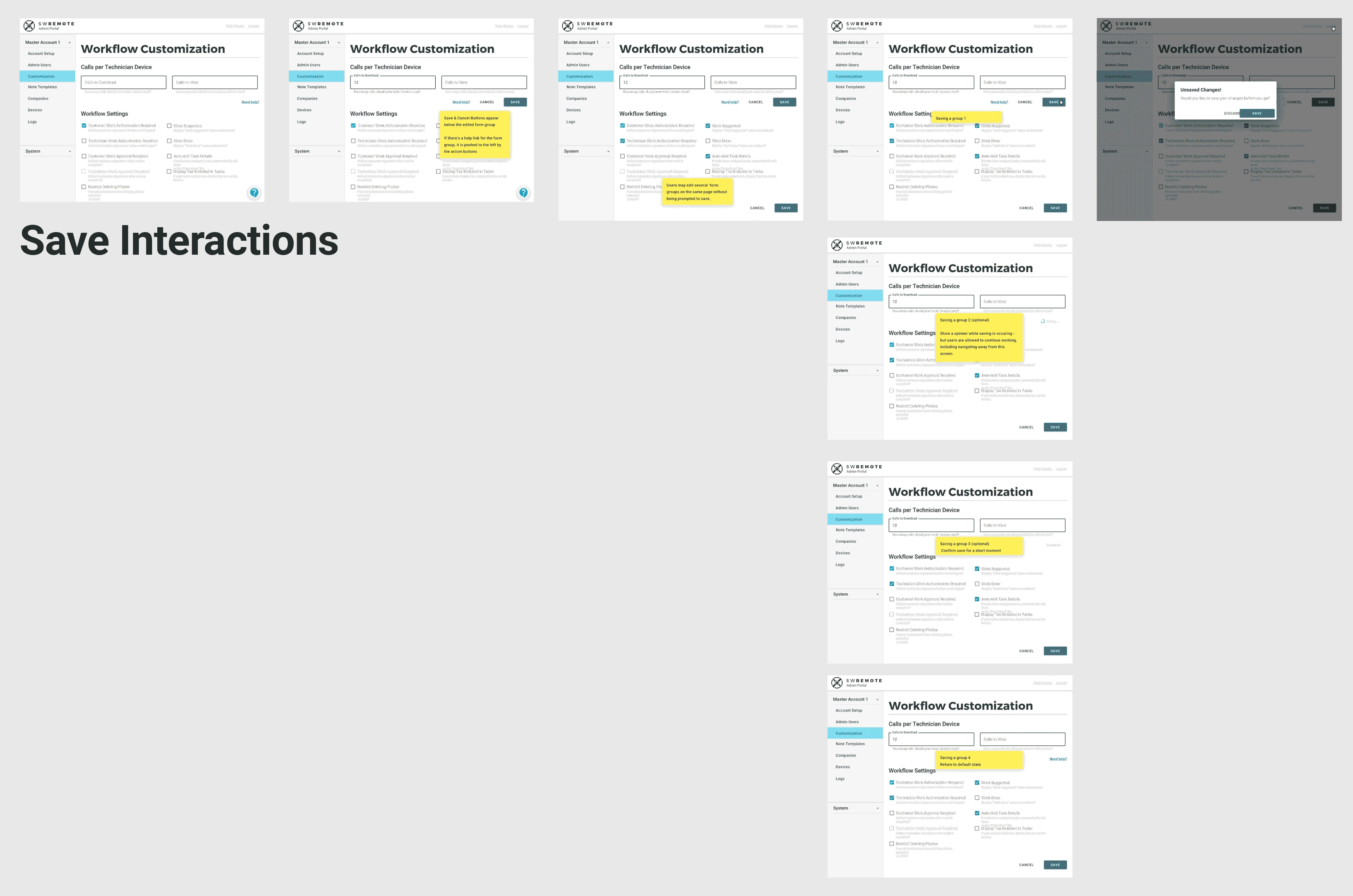
I also created a walkthrough of how I expected save interactions to work throughout the system, so the engineers would know how to start programming saving interactions in their component design.
Prototyping
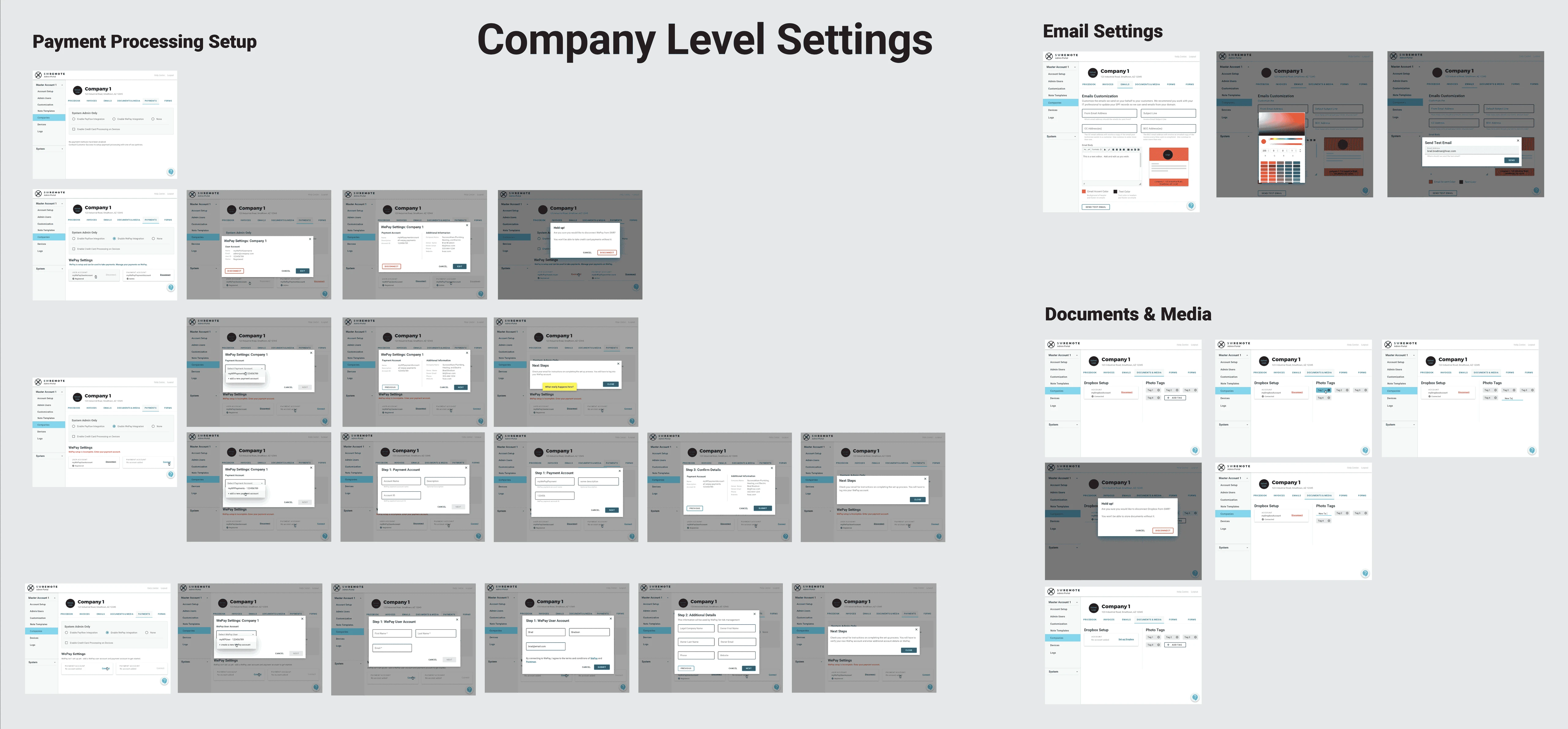
Prototyping went through three distinct phases, during the first round, I solidified the visual design of each page and walked users through the system to hammer out points of confusion. The second round involved fleshing out variant workflows and scenarios, and creating all the appropriate screens to represent them. These were also validated again users. The third round was diving in edge cases and detailing errors and interactions for the engineering team.
Testing
Testing the design happened continuously, although due to time constraints, I only had time to test against internal users of varying level of familiarity with the system.
Key Insight
The more we improved the experience, the more the problems with the existing information architecture became apparent.Hand-off & Design Specs
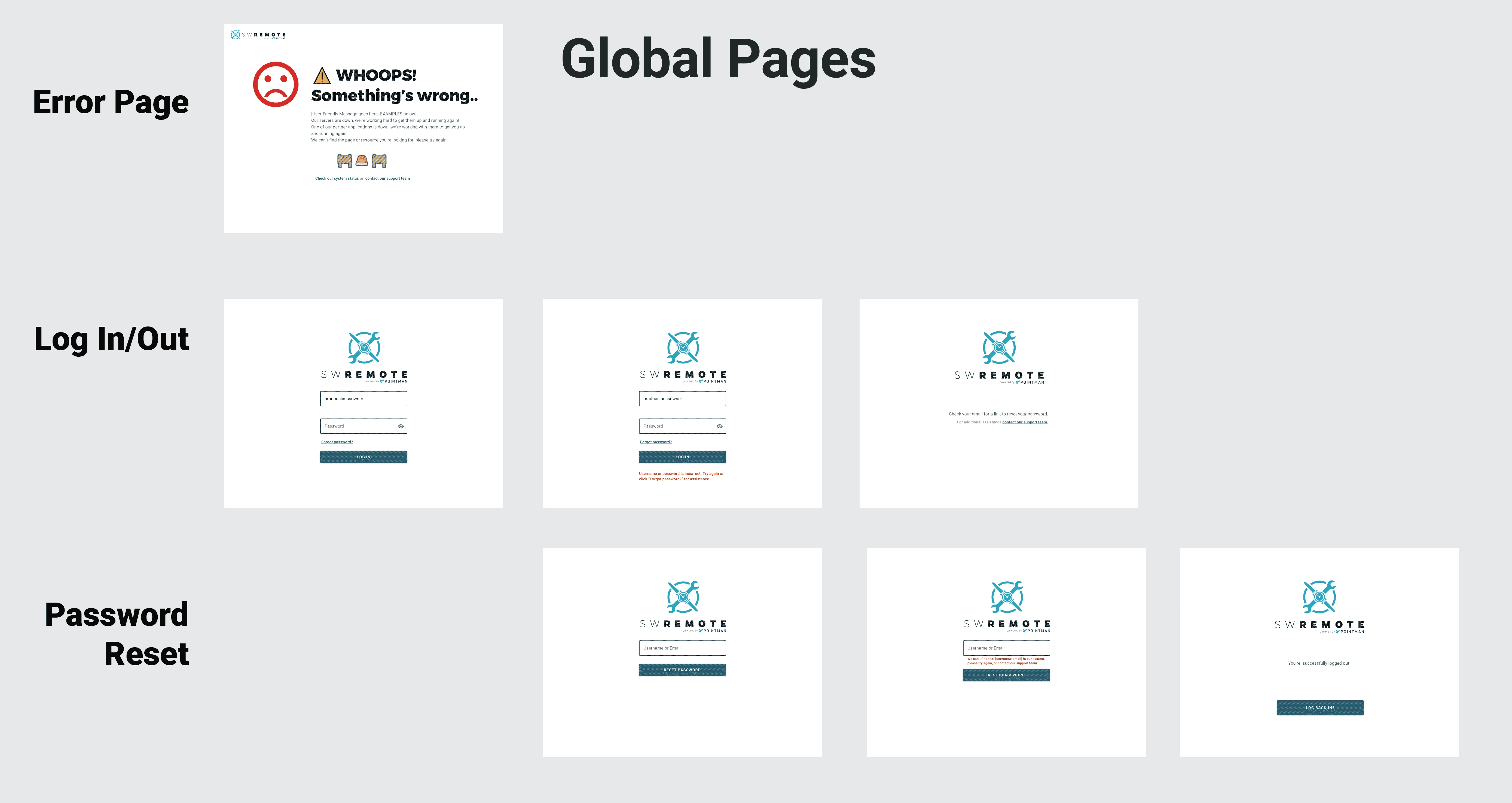
The hand-off occurred in stages, as the engineers were ready before the designs were 100% done. We were able to determine what sections the engineers would work on first, and I could design out ahead of them. Below you can see an example of the design specs handed off for the login page. More information was recorded as comments in the InVision project that served as our source of truth.
