FIFCO USA Intranet
Creating a Unified Digital Workplace for Distributed Teams
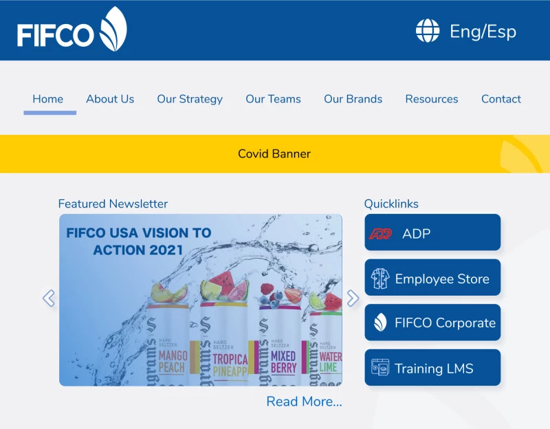
Replaced an outdated, non-responsive SharePoint system with a user-centered intranet that serves diverse employee needs across the US, from at-home workers to in-office and factory personnel.
- Role
- Designer & Lead Developer
- Timeline:
- 8-12 months ◊ Fall 2020 -Fall 2021
- Team ◊ FIFCO USA
- Jenny Keller, Denise Nadal and Joe Rice
- Impact
-
- saved over $20K/yr in subscriptions
- created a single source of truth
- centralized content management
Research
Initial Project Requirements
Through an interview process with the Talent Team SME, we developed the following project brief:
Business goals
-
Need an easy way to share and update content with all FIFCO employees, including Costa Rica, that works on any device. The existing solution (sharepoint) is full of outdated content, is difficult to use, and not responsive.
-
Need a single source of truth for company policies and procedures and place to embody company culture and drive change.
-
What outcomes do you want to achieve — are they measurable?
- Improve communication between CR and USA
- Improve cross functional communication between teams
- Less duplication of resources
Product Purpose
Build a content management system for a company-wide intranet system. It should be a one-stop destination for information about company policies, procedures and news.
Target audience
FIFCOUSA Employees. They will be looking for company policies, procedures, information, and news. We want then to view the newsletter and engage with timely content
- this includes employees who are not tech savvy, do not have FIFCO accounts, may not have smart phones
- some do not speak english (costa rica)
- disabilities/accessibility issues.
User Research
We used a combination of interviews and surveys to uncover the common needs of employees at FIFCO USA. Based on the responses we received we were able to determine what content needed to be added to the site and what links needed highest visibility and ease of access. We were able to use these insights to design our site navigation and information architecture.

Survey Questions
- How satisfied are you with the resources and support available to you in your role?
- What is the one thing that would make the biggest difference for you?
- What productivity or administrative tools or websites do you use during a normal workday?
- What administrative tasks do you complete online?
- What information do you need to look up regularly?
- What information about our company or other teams at our company, do you wish you knew?
- What would you like to see on a website designed for FIFCO USA employees?
Design Process
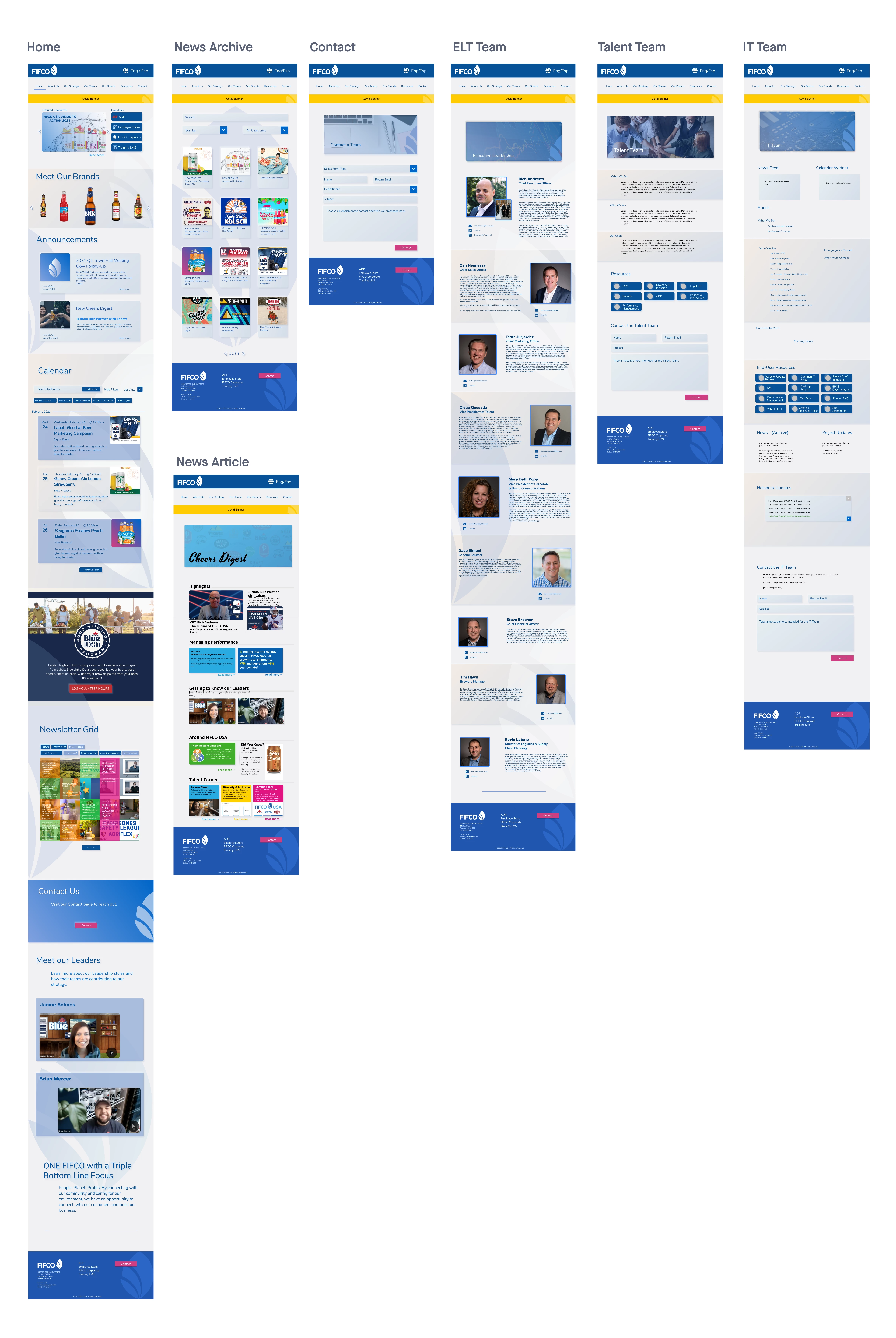
We turned the designs into Frigma prototypes and tested them against several stakeholders in the organization. We used their feedback to further refine the designs.
Development
For development, I started by building a static site containing examples of all the page templates I would need to create. For the styling, I used the Material Design Boostrap library to set us up and running faster. I then set up a local copy of WordPress using the Local by Flywheel app, and the Understrap theme. From there I was able to put my static site's code into the Understrap theme and start to customize it as needed.
From there, I just had to build and test all the page templates, widgets, custon plugins, and set up all the sites and plugins.
Results & Impact
User Experience Improvements
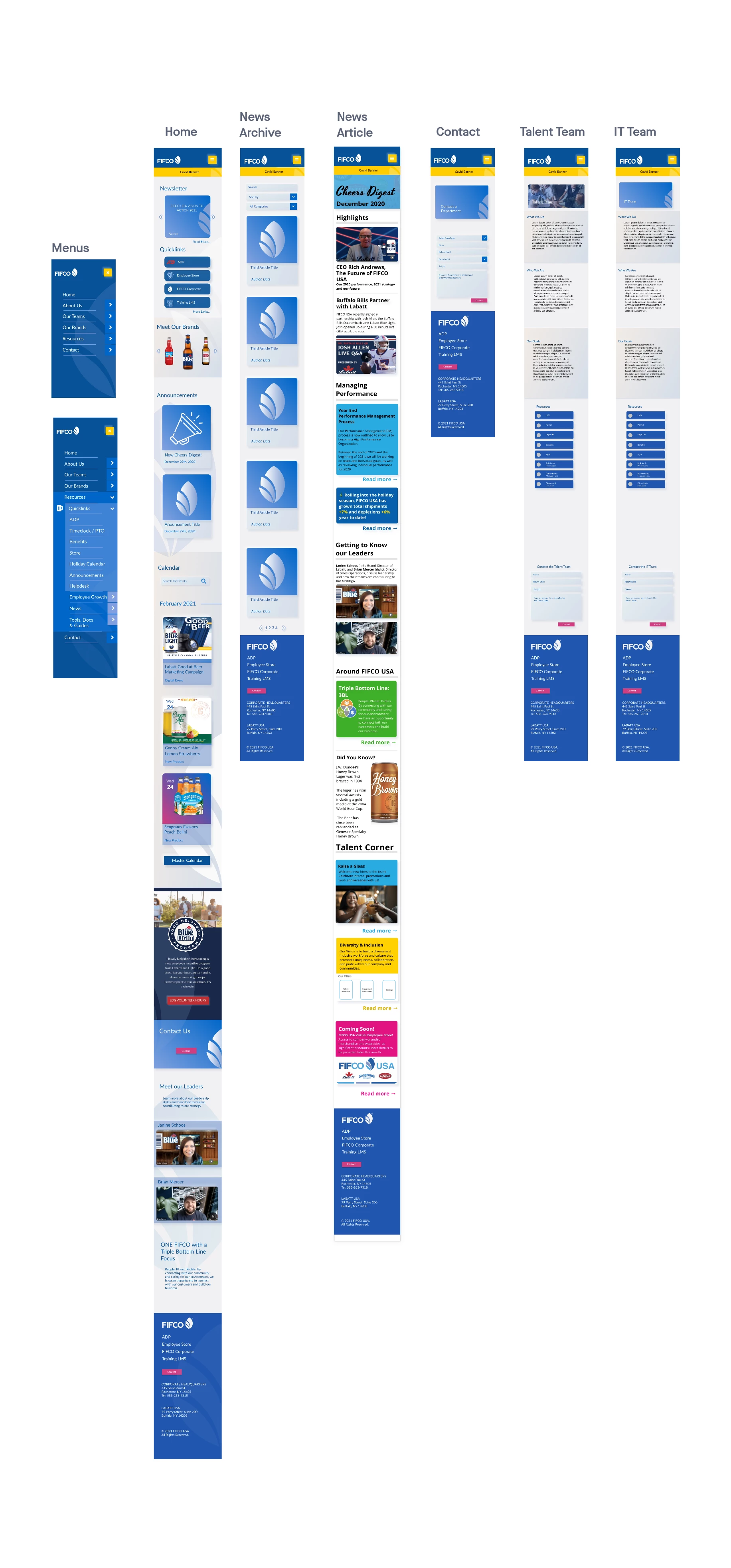
- Enhanced accessibility: Responsive design serving employees across device types
- Improved information findability: Research-based navigation reducing search time
- Streamlined workflows: Single source of truth eliminating information hunting
Organizational Benefits
- Reduced resource duplication: Centralized content management
- Improved policy compliance: Clear, accessible procedures and guidelines
- Enhanced company culture: Platform supporting organizational change initiatives
- Cost-effective solution: WordPress providing scalable, maintainable platform
Technical Success Metrics
- Full responsive functionality across desktop, tablet, and mobile devices
- Accessible design meeting diverse user needs and abilities
- Scalable architecture supporting organizational growth
- Maintainable codebase enabling sustainable long-term operation
Key Learnings
Inclusive Design Research
Working with such a diverse user base (varying tech skills, languages, device access, and abilities) reinforced the importance of comprehensive user research that accounts for real-world constraints, not just ideal user scenarios.
Cross-Cultural UX Considerations
Designing for international teams requires understanding not just language differences, but varying work patterns, technology access, and communication preferences across cultures.
Stakeholder Collaboration in Enterprise UX
Successfully managing multiple stakeholders (IT, Talent Team, various departments) while maintaining user-centered design principles required clear communication of research findings and design rationale.
Resource-Constrained Innovation
Building a comprehensive intranet alongside regular duties demonstrated how strategic planning and phased development can achieve significant UX improvements within limited resources.
Content Strategy as UX Foundation
The project reinforced that information architecture based on actual user research creates more successful experiences than assumptions about what users "should" want.
Design Process Innovation
Research-Driven Information Architecture
The combination of surveys and interviews provided both quantitative priority data and qualitative insights into user mental models, creating a more nuanced understanding than either method alone.
Collaborative Design Validation
Using Figma prototypes for stakeholder testing enabled rapid iteration and ensured the final design met both user needs and organizational requirements.
Technical UX Integration
Leading both design and development provided unique insights into how technical decisions impact user experience, enabling more informed trade-offs between functionality and usability.
Future Opportunities
Based on the project's success, identified opportunities for continued improvement:
- Analytics integration for data-driven content optimization
- Personalization features based on user roles and departments
- Enhanced collaboration tools for cross-team project coordination
- Advanced search functionality for large content repositories
- Mobile app development for field worker accessibility
This project demonstrated how thorough user research, inclusive design thinking, and strategic technical implementation can transform organizational communication and create meaningful impact for diverse user groups.


